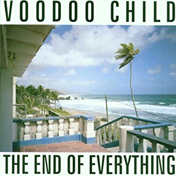
Album Cover

Voodoo Child The End Of Everything LP – CD Trophy Records

23,5 € delete

Subtotal

42,5 €

Shipping and final taxes will be calculated at checkout
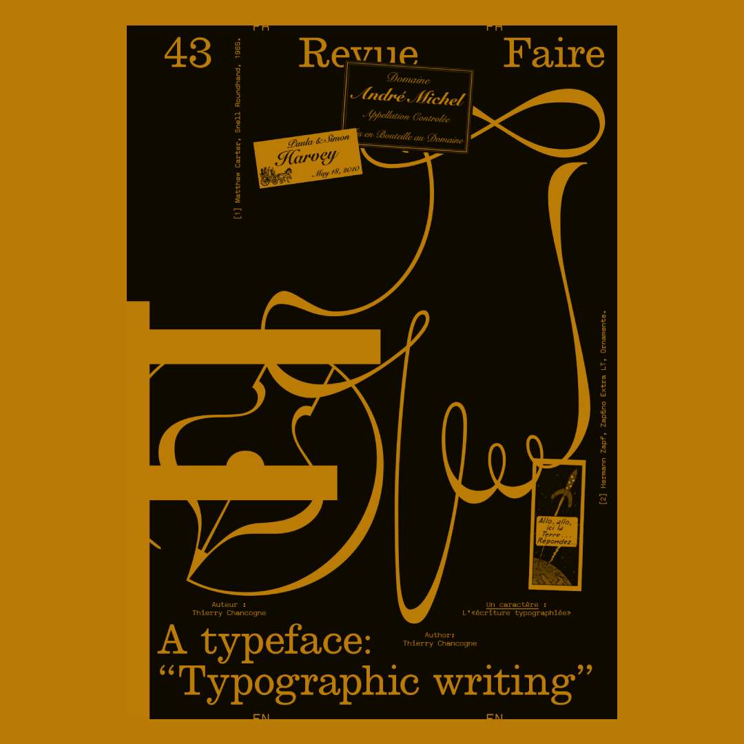
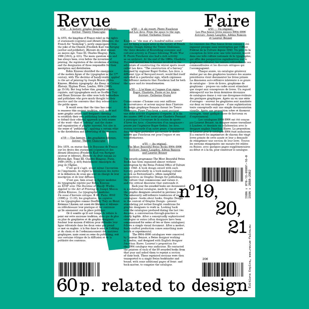
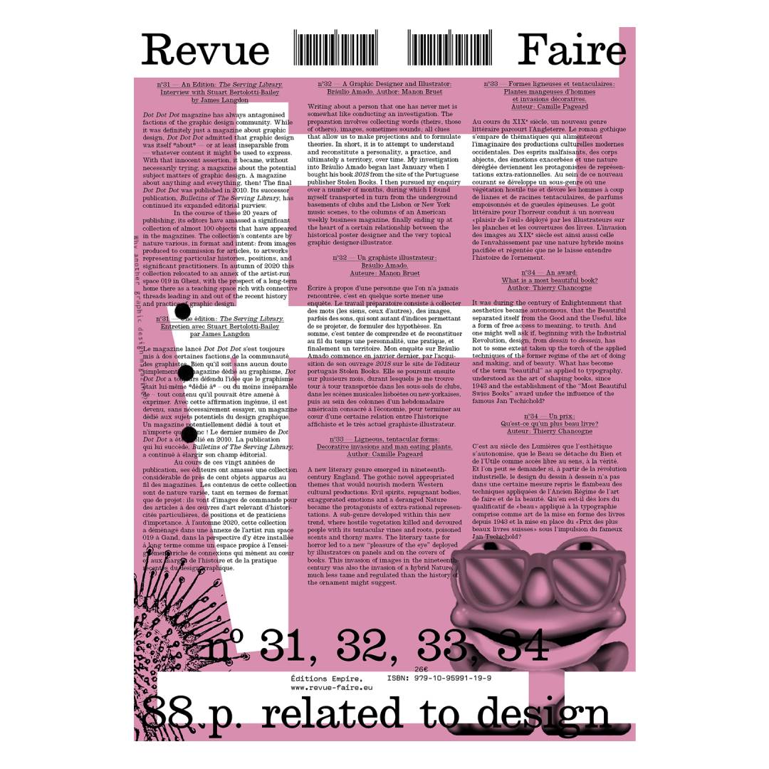
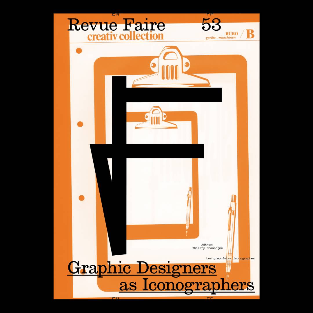
Faire To look at things #43 – A typeface:

The reissue of issue 43 of the critical graphic design journal: a reflection on the dynamics of formal relationships between writing and typography. "In 1920, Francis Thibaudeau dedicated his manual of modern typography, La Lettre d'imprimerie, to Auriol, a letterer and typographer from the beginning of the century, whom he described as "the innovator of typographic writing." The book is set using multiple variants of Auriol's striking typefaces—notably the outline font Auriol-champlevé, the stencil Auriol labeur, the narrow Française Légère, and the bold Robur Noir. And it should be noted that perhaps the most widespread of these alphabets, Auriol labeur, is a typeface which defends both the pictorial dynamics of its components, visibly brushed with an august gesture, as well as the more-or-less industrial technicality of the bridges of this stencil typeface. One could be quite rightly struck by the oxymoron of so-called "typographic writing." How does writing, along with its contingent, situated, and personal dynamics function in conjunction with the industrial and normative generalization of typography? Can a typeface, an abstract ideal, an orthographic contract, act upon historical movements and the specific and constantly renewed inclusion of alphabets? What happens to cursiveness it is somehow "reclaimed" by the relatively definitive, or at the very least perennial, form of fonts?"
  • To look at things #43 – A typeface:
MAGAZINE IN
stock
7€ Buy

Newsletter

Subscribe for Materia Prima good news.